My Role
UX/UI, Illustration, Web Design, Graphic design, Art Direction
Project Type
Contract work
Various freelance projects.
UX/UI, Illustration, Web Design, Graphic design, Art Direction
Contract work
Various freelance projects.
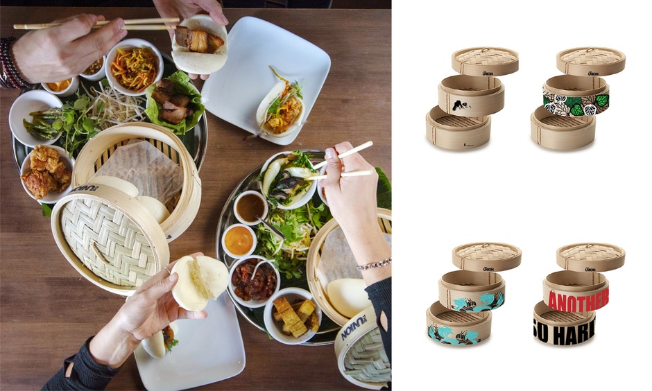
Bamboo steamer designs for The Union restaurant. The promoted dish encourages customers to build and customize their own baos using food and vegies presented in the stackable bamboo steamers. The designs attract customers to take photos and post their creations to social media therefore promoting the restaurant. I have researched for printing methods that comply with food safety. I have also created a special plant-based pattern after hearing staff members wanting to differentiate vegan options amongst others.
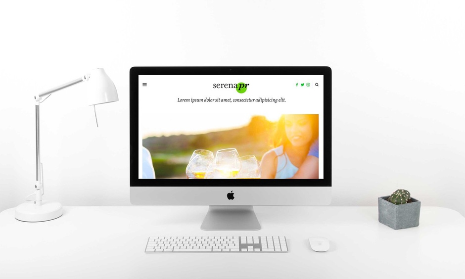
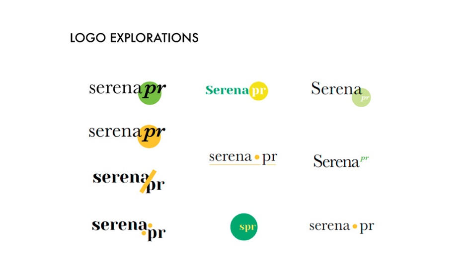
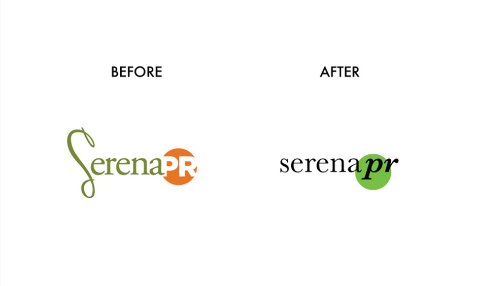
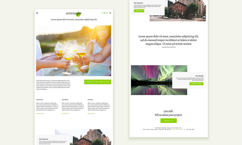
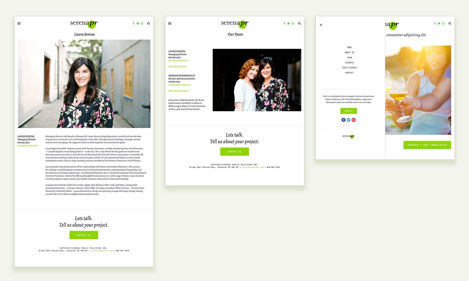
Serena Public Relations Inc.'s re-brand involved an updated logo, colour pallet and a new website. The proposed new brand colour gave the brand a motivated feel yet kept the brand's heritage. The proposed font use and new logo gave the brand an approachable modern personality. A responsive website was designed to showcase the marketing duo's elegant style and reliable business approach.
The goal of this project is to promote the company's value and best work by having a full refresh throughout all media.
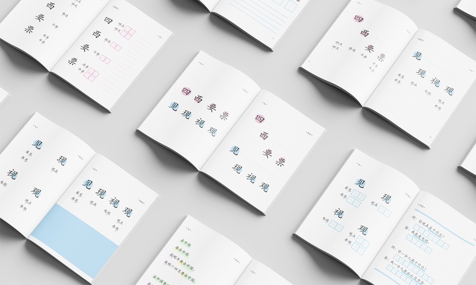
Inner spreads designed for Noet Education's unconventional language training system. The minimal design allows the users to focus on the form of Chinese characters. Lots of negative spaces are left for users to practice writing and taking notes.
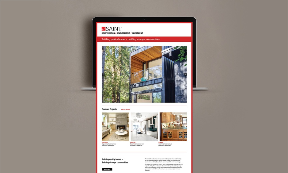
Homepage designed for one of Vancouver's most trusted boutique construction firms. Efficient Information architecture ensures existing client to find what they need. Large high-quality images make sure potential clients are inspired.
